01Context
A small screen with a big job.
Vieclam24h is a Vietnamese job platform run by SieuViet Group. Its promise is in the tagline: faster, easier. I owned UX improvements for the desktop experience, a product used by more than 50,000 people every month.
Login looks like a minor screen. On a job platform it is not. Jobseekers can browse freely, but to apply they need an account. So the login flow sits directly between a jobseeker’s intent and the platform’s core metric, applications.
02The goal
Get more people through the gate, without lowering the bar.
The business goal and the user goal pointed the same way. Users wanted to reach the job they clicked on. The business wanted more applications. The design had to remove friction while still creating real accounts that employers could trust.
I framed success with two numbers we could track after launch. Successful logins measured whether people got through. Job applications measured whether getting through led to the action that mattered.
03What changed
Three decisions shaped the new flow.
One entry point for login and sign-up
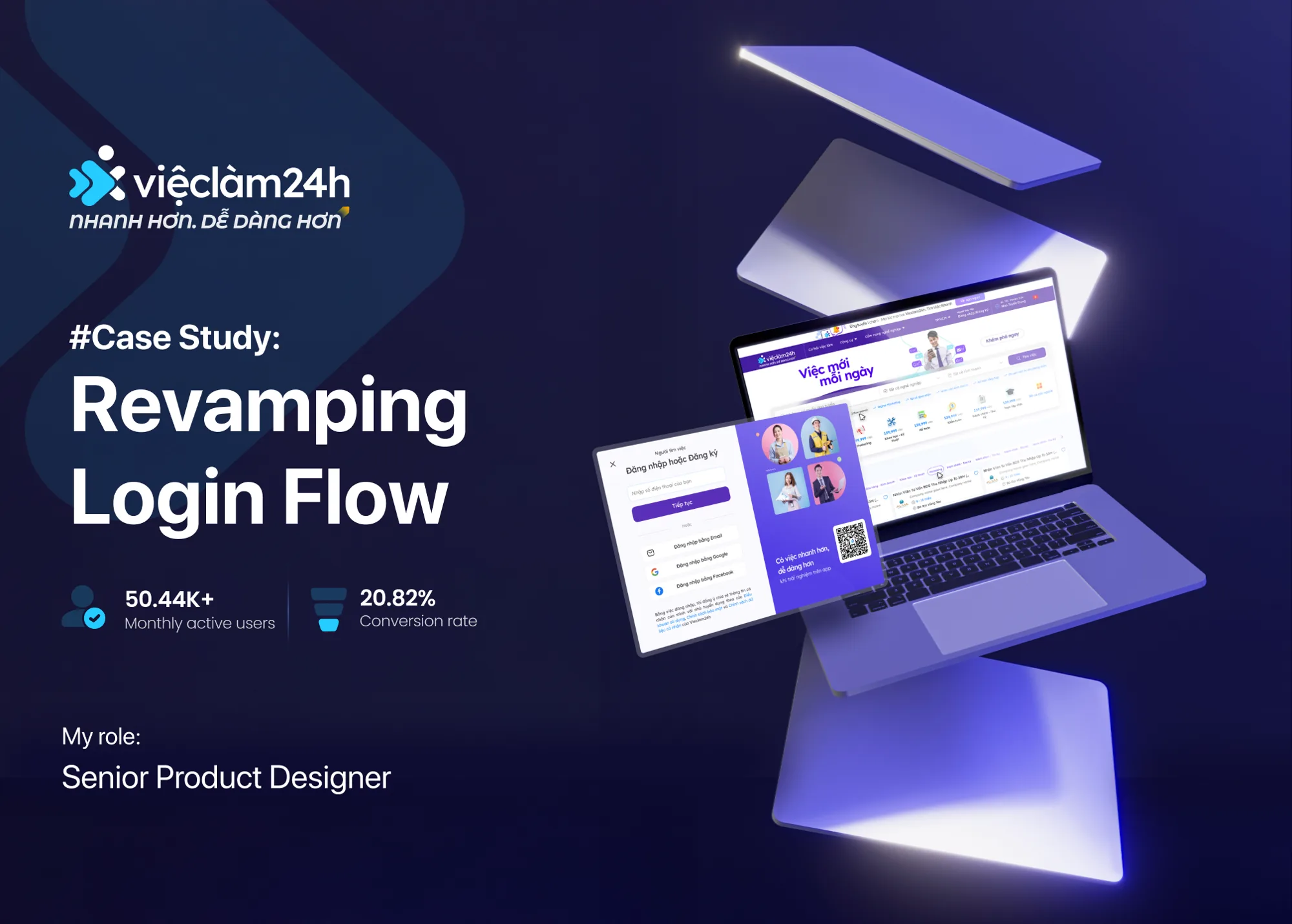
The modal reads “Log in or sign up”. Jobseekers don’t need to remember whether they already have an account. They enter their details and the system works out the rest.
Phone number first, other options second
A single phone field and one Continue button lead the form. Email, Google and Facebook sit below as clear alternatives, so no one is blocked by a method they don’t use.
Keep the job in view
Login opens as a modal on top of the page. The jobseeker never loses the job they were looking at, which keeps their reason to finish in sight.
A side panel reinforces the brand promise of getting a job faster and easier. It also offers a QR code to continue in the mobile app, for people who prefer to apply on their phone.
Friction removed
- Choosing between “log in” and “sign up” before starting.
- Being pushed to a single sign-in method.
- Losing the job page when the login form appears.
Trust kept
- Every account stays tied to a phone number, an email, or a Google or Facebook identity.
- Terms and privacy links stay visible at the point of consent.
- The brand promise is visible at the moment of commitment.
04Results
More logins led to more applications.
Within one month of launch, successful logins rose by 8.4% and job applications rose by 5%. The second number is the one I care about most. It shows the extra logins were real jobseekers who went on to apply, not just accounts created and abandoned.
Want the full story?
This is a short read. The full case, with funnel data, research and design iterations, is available on request. Email me and I’ll walk you through it.